Stop Human Trafficking

A social issue AD series
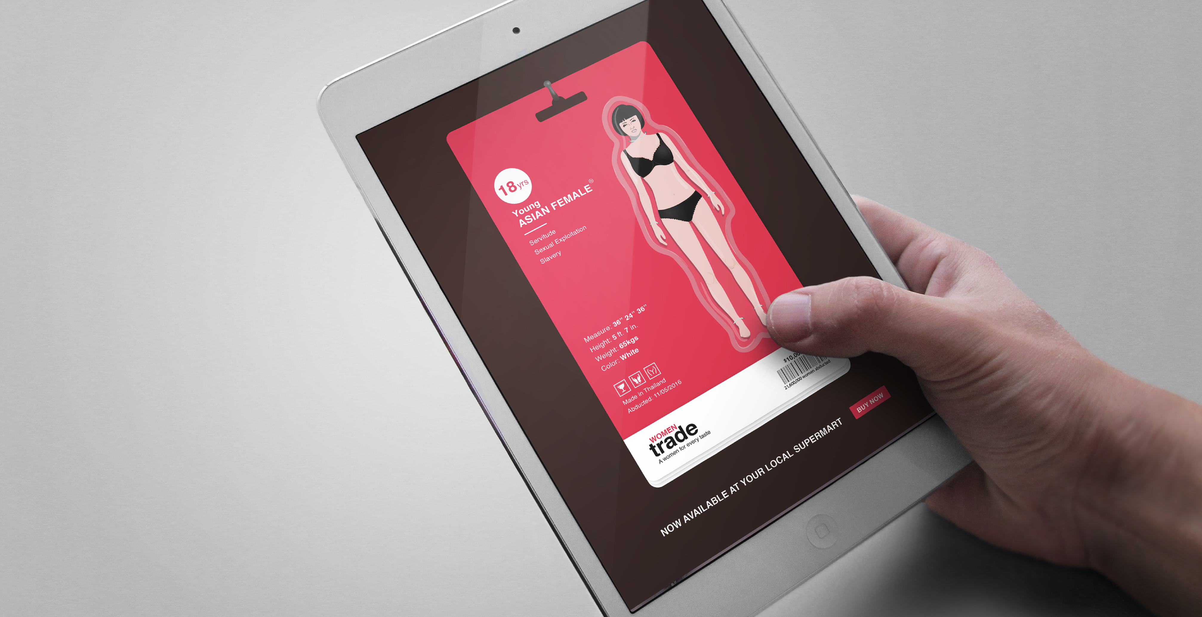
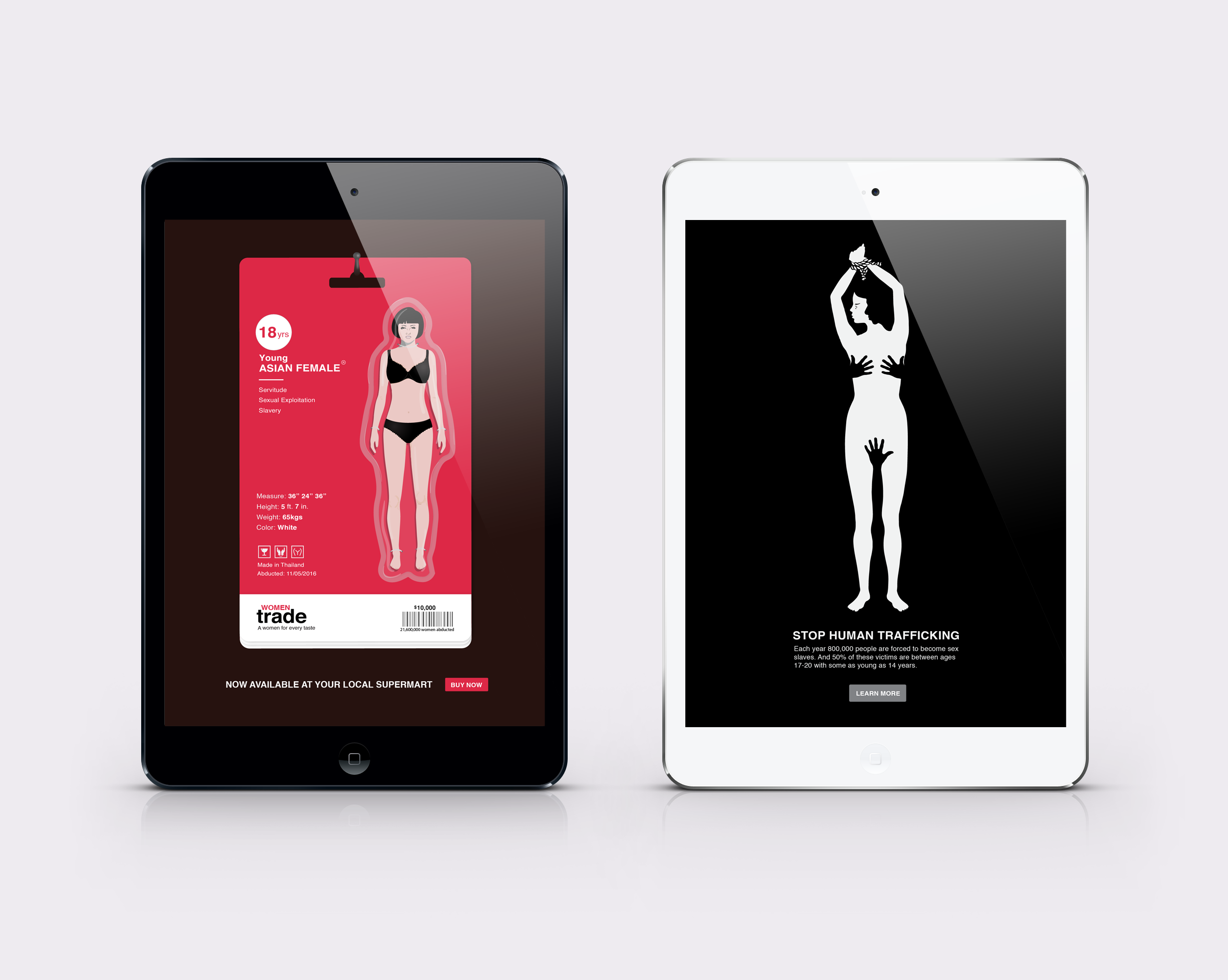
Ad design show on Ipad

OVERVIEW

Awareness and education are key to beating sex trafficking

Human trafficking is the 2nd largest criminal enterprise after narcotics. Close to 80% of the human trafficking across the world is done for sexual exploitation.

'Stop human trafficking' is a social issues AD series to bring awareness to the growing sex trafficking industry. This will be a static AD featured in the Fliboard tablet app with an interactive call to action button.
ROLE Research, Concept, Branding, Illustration & Visual Design
WHEN 3 weeks, Spring 2016

Existing awareness campaigns and posters are very graphic and literal. I wanted to take up the challenge to convey the nature of the crime, as well as its frequency through use of illustrations. After ideating through a few different concepts, I decided on two final directions for the AD.

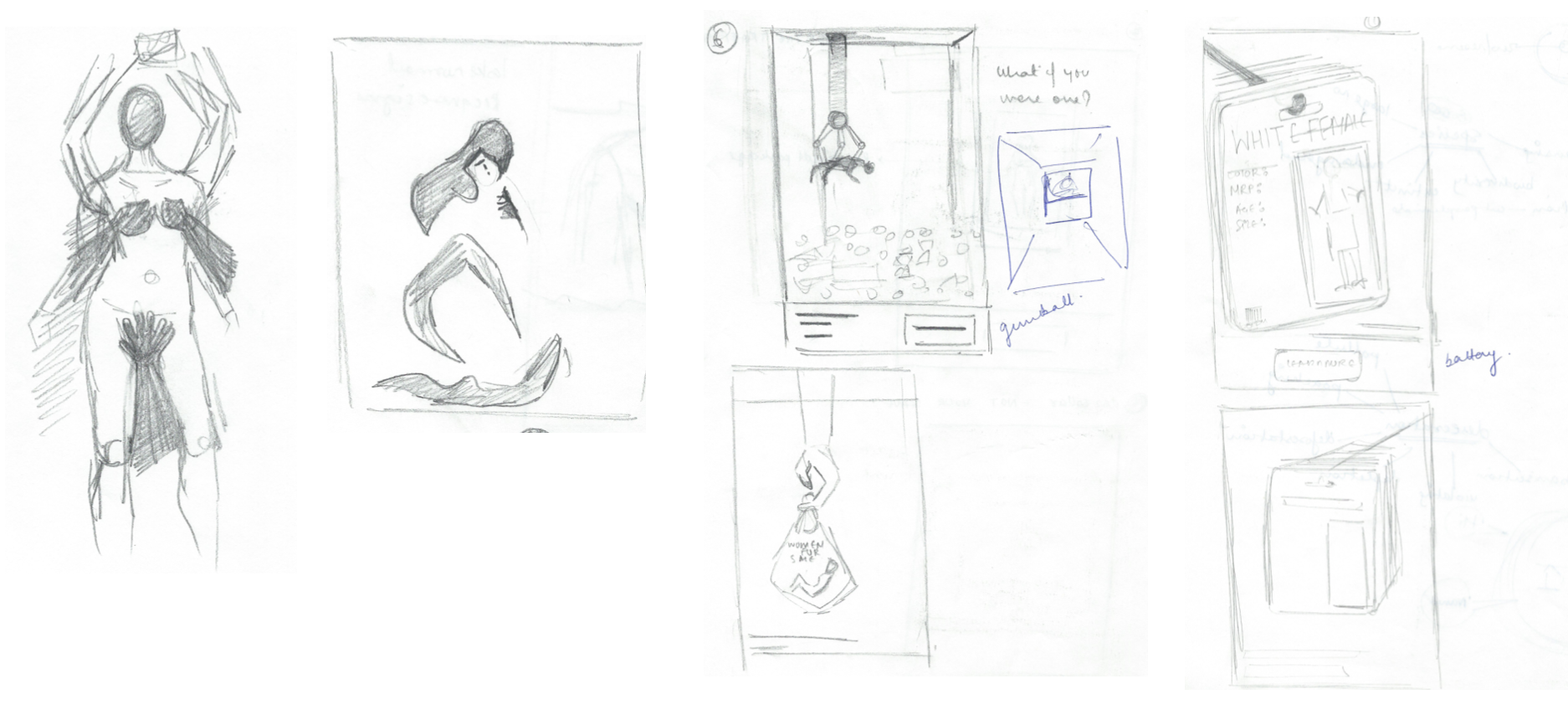
exploration sketches

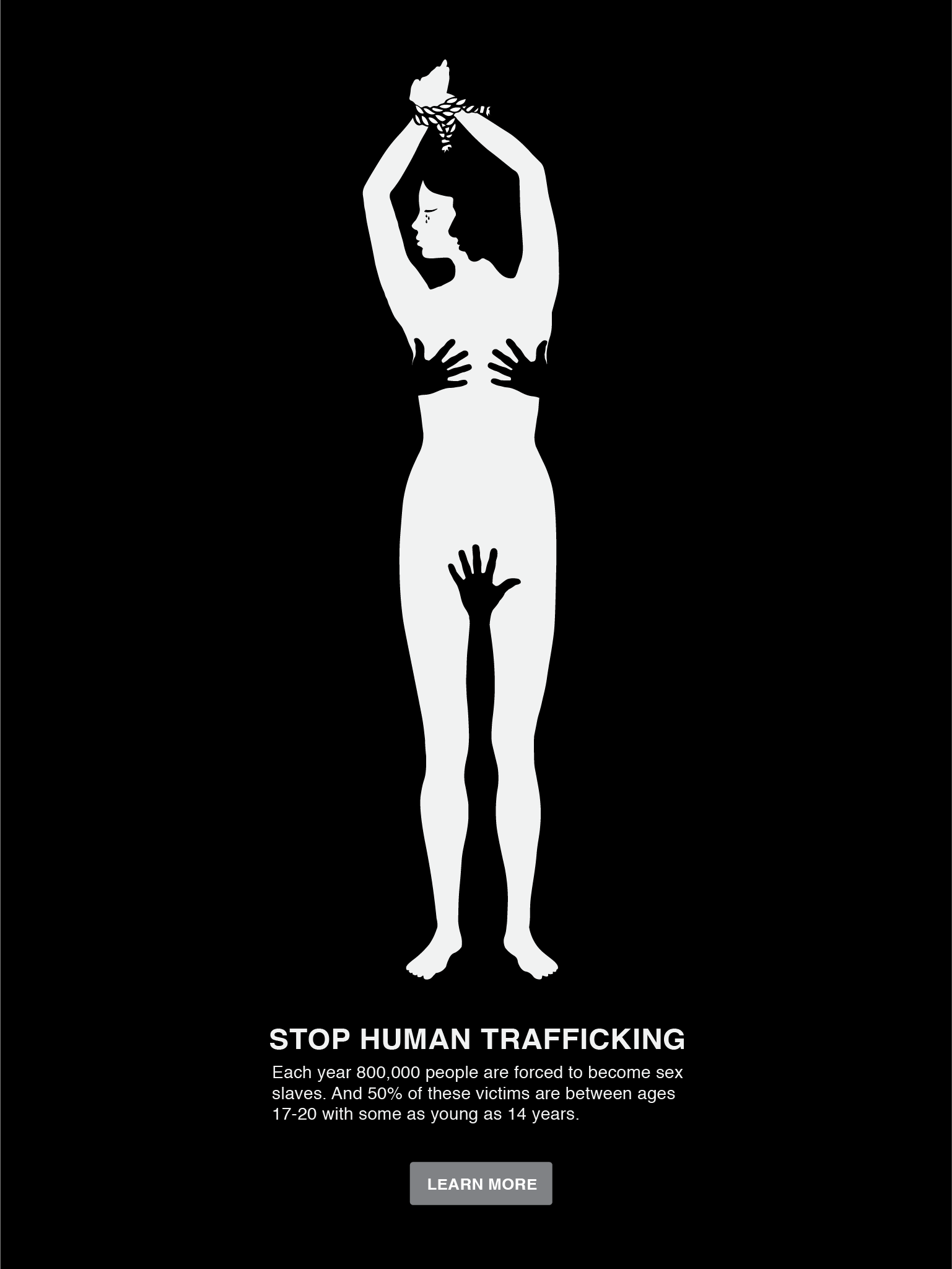
01 - Coercion

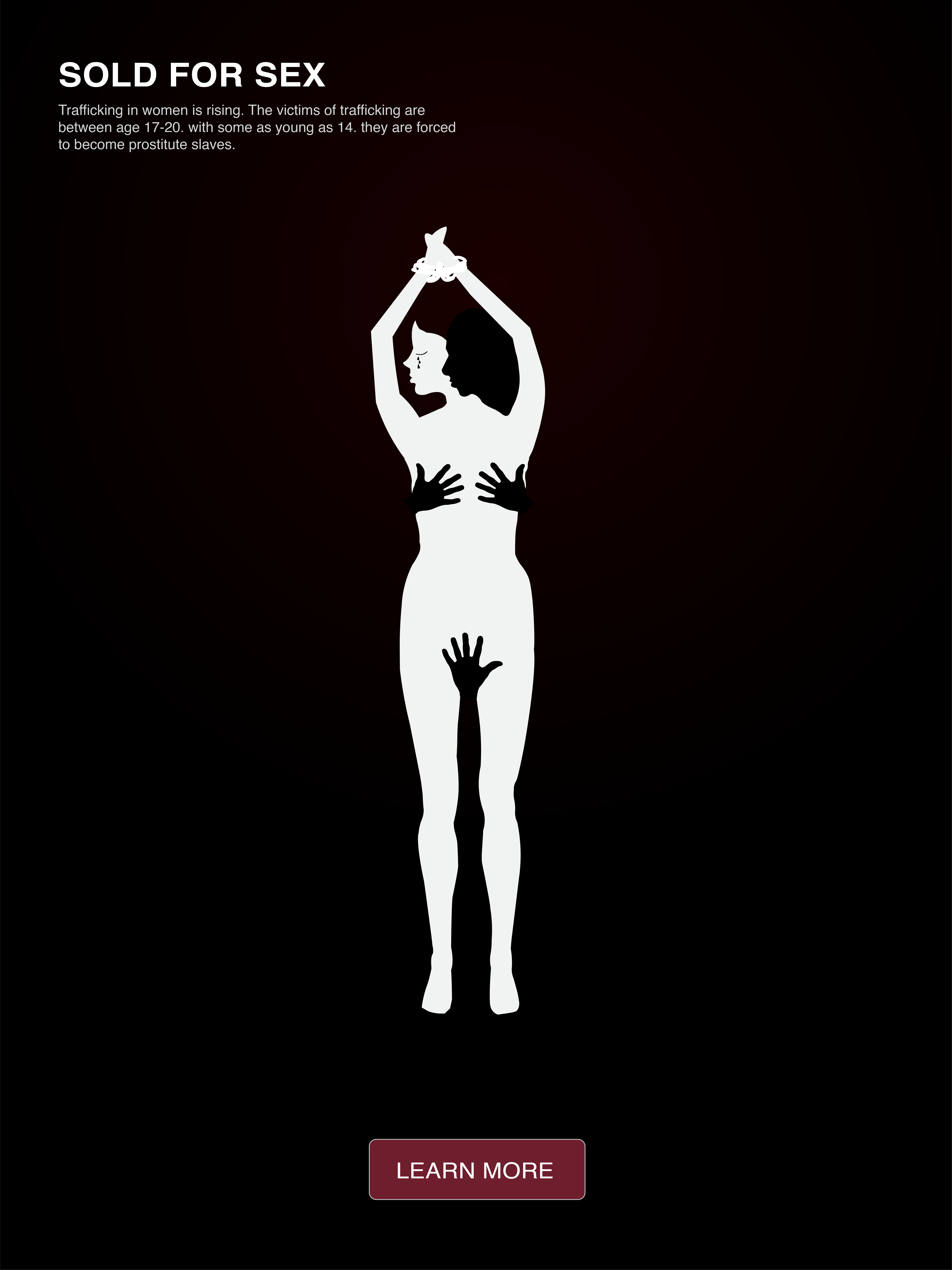
A $32 billion industry, Human Trafficking is slowly becoming the world’s largest crime against humanity. Use of a monochromatic, dark colors and figure ground help create a subtle yet strong message about how the human trafficking industry goes unnoticed.

First iteration for the AD design

Iterations

The colored CTA and the alignment of the content was taking focus away from the imagery. The hero of the image had to be the illustration, which should then lead the user to click the CTA.

Final design

The final iteration put the illustration first and then the data. The strong vertical alignment helped draw users focus from the illustration to the CTA.

final iteration

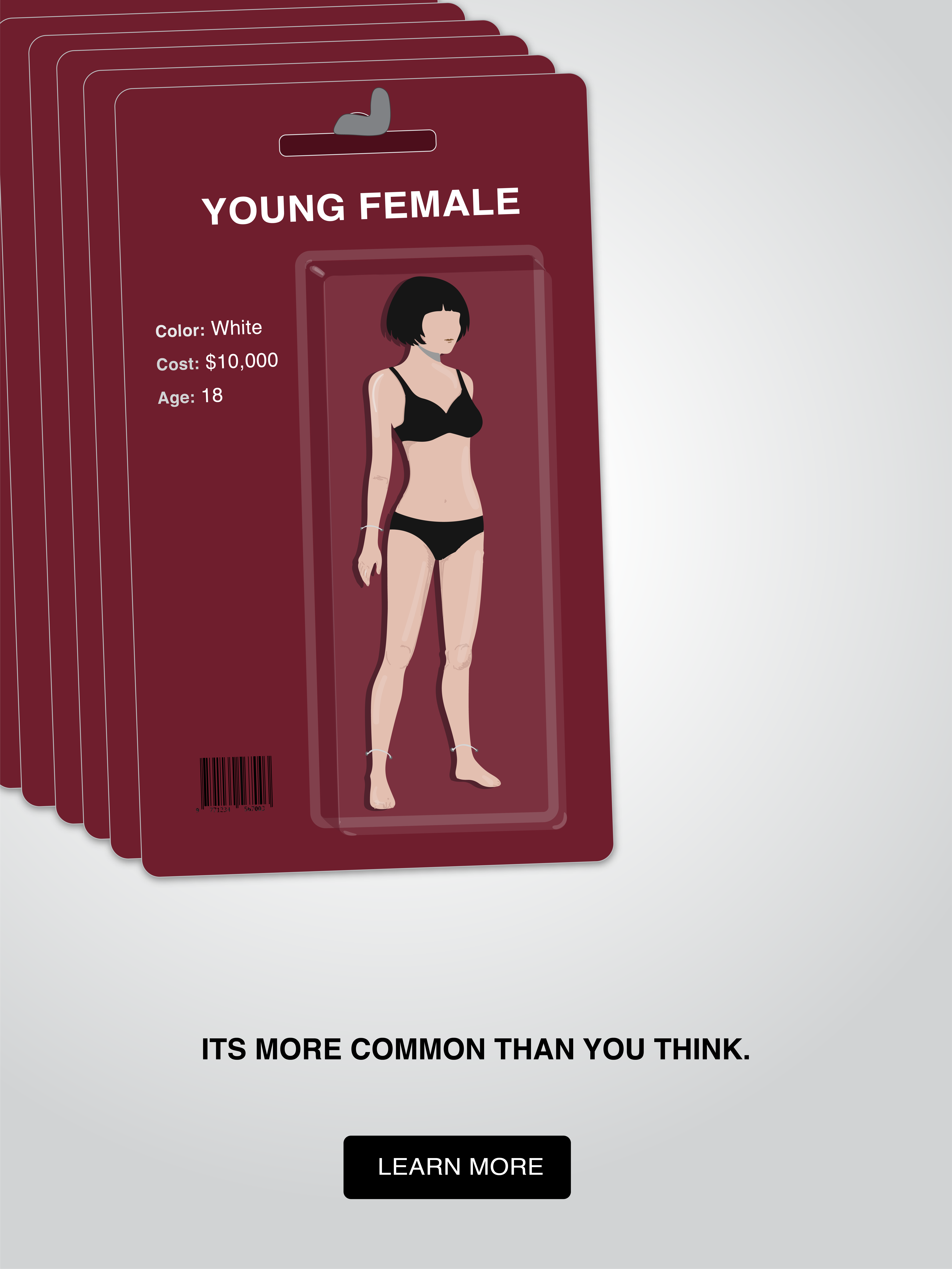
02 - Metaphor

This approach will bring light to the seriousness of the crime through satirical visuals. The focus is to create a jarring, metaphorical story that shows how common the crime is.

Mood board

Iterations

As I iterated through this concept, I realized that I needed to create a strong branding and packaging for the product to sell the story.

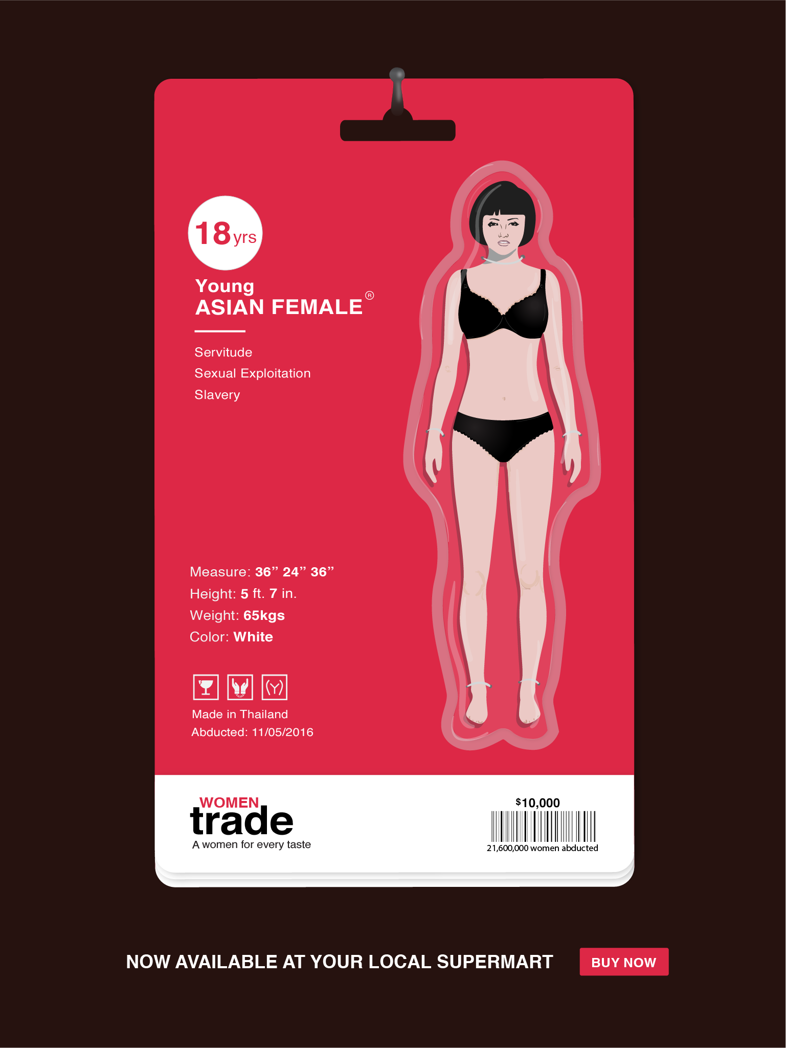
Final design

The bright color catches the eye and grabs the users attention. This final iteration adds smaller details as if the human is a real product. From details about the top features of buying the product to packaging and manufacturing details.

final iteration
Final screens of the ad

TAKEAWAYS

How did it go?

The theme of this project was a hard issue to design for. It was especially challenging to come up with a compelling branding for a human. I also learnt the important lesson that the copy of a poster has to be as provoking as the illustration.